1. What is a Candlestick Chart?
A candlestick chart is a type of financial chart used to describe price movements of securities, derivatives, and currencies. Each “candlestick” represents one specific period — it could be a minute, hour, day, week, or month — and shows four key pieces of information: the open, high, low, and close prices.
- Open: where the price began.
- High: the highest price reached.
- Low: the lowest price dropped to.
- Close: where it finished.
 (1).jpg
)
Each candle has two main parts:
- The Body: shows the range between the opening and closing prices.
- The Wick (or Shadow): represents the highest and lowest prices within that time frame.
If the candle is green (or white), it means the closing price was higher than the opening price — showing bullish (upward) momentum. If it’s red (or black), it means the closing price was lower than the opening price — showing bearish (downward) momentum.
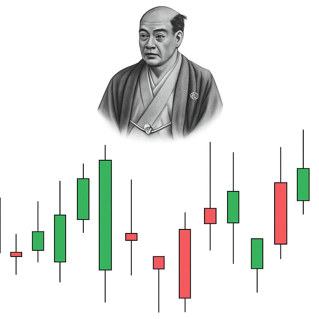
2. History and Origin of Candlestick Patterns
The origin of the candlestick chart dates back to the 18th century in Japan. A rice trader named Munehisa Homma from Sakata is credited with developing this unique charting method. He discovered that human emotions significantly influenced the price of rice and created a system to record these patterns visually — the first candlestick charts.
Homma’s techniques evolved over time, combining psychological insights with price data. His method became the foundation for what modern traders use today. By the late 20th century, Steve Nison, an American technical analyst, introduced Japanese candlestick charting to the Western world through his famous book Japanese Candlestick Charting Techniques.
Since then, candlestick charts have become one of the most widely used tools in stock, forex, and crypto trading worldwide.
3. Why Candlesticks Are Used in Trading
The popularity of candlestick charts is not an accident. They provide a complete visual representation of price action that line or bar charts simply can’t match. Here’s why traders rely on candlestick charts:
 (1).jpg
)
- Clear Visualization of Market Sentiment — Each candlestick tells a story — who dominated the market in that session, buyers or sellers. The color and size of the candle instantly communicate the strength of the move.
- Quick Pattern Recognition — Candlestick patterns such as Doji, Hammer, Shooting Star, and Engulfing Pattern can help traders predict future price movements. This allows traders to react quickly to potential trend reversals or continuations.
- Combination of Data in One Candle — Instead of just showing closing prices (like line charts), candlestick charts show open, high, low, and close — giving traders a complete picture of what happened within a specific time period.
- Works Across All Markets — Whether you trade stocks, forex, commodities, or cryptocurrencies, the candlestick chart works universally. Market psychology remains the same everywhere — and candlesticks reveal it visually.
- Supports Technical Indicators — Candlestick charts can be used along with other technical tools such as moving averages, RSI, and Bollinger Bands for more accurate trading strategies.
4. Line vs Bar vs Candlestick Charts
There are several types of charts used in trading, but the candlestick chart stands out for its clarity and detail. Let’s compare it with the other two popular types: line charts and bar charts.
Line Charts
A line chart connects the closing prices of an asset over time. It’s simple and clean, making it ideal for beginners who want to see the overall trend. However, it lacks detail — you can’t see intraday highs, lows, or market sentiment.
Bar Charts
A bar chart shows the open, high, low, and close like a candlestick chart. However, it uses vertical lines and small horizontal ticks to represent prices. While detailed, bar charts are harder to read quickly compared to candlestick charts.
Candlestick Charts
Candlestick charts combine the simplicity of line charts and the detail of bar charts. They are visually richer and color-coded, making it easier to identify bullish and bearish trends. This blend of data and emotion makes them the preferred choice among traders worldwide.
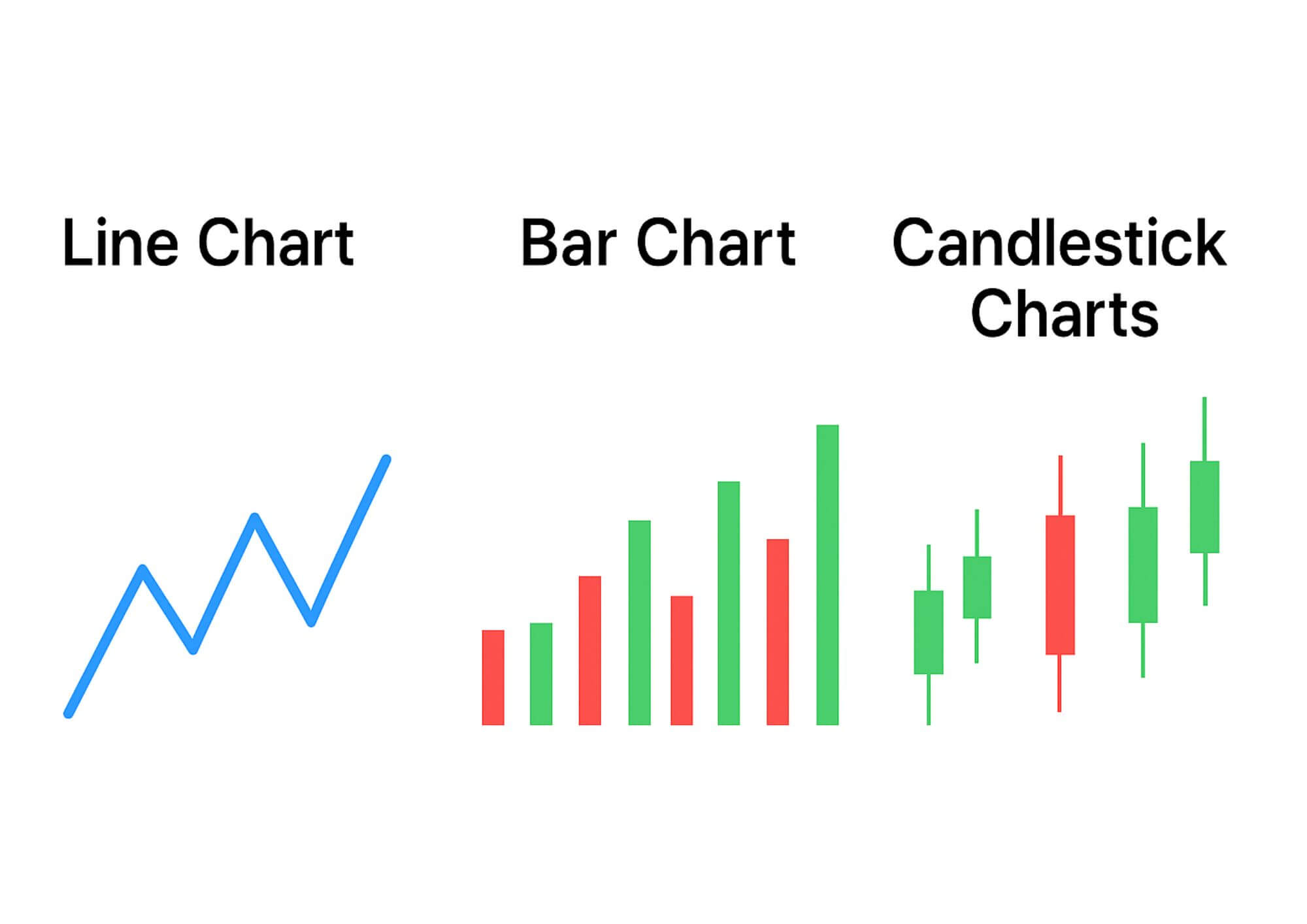
- Line Chart = Trend only
- Bar Chart = Detailed but less visual
- Candlestick Chart = Detailed + Easy to read
5. Advantages of Using Candlestick Charts
- Instant Market Clarity: Candlesticks give a visual snapshot of market direction within seconds.
- Emotional Insight: Colors and shapes reflect trader sentiment — fear, greed, or indecision.
- Historical Accuracy: Patterns repeat over time, allowing traders to predict future behavior.
- Adaptability: Suitable for all timeframes — daily, weekly, or intraday trading.
- Strong Technical Basis: Integrates easily with other trading indicators for advanced analysis.
6. Common Candlestick Patterns
When learning candlestick charts, recognizing common patterns is vital. A few of the most famous include:
- Doji: Shows market indecision (open and close are nearly equal).
- Hammer: Signals a possible bullish reversal after a downtrend.
- Shooting Star: Indicates a bearish reversal after an uptrend.
- Bullish Engulfing: Suggests the beginning of an upward trend.
- Bearish Engulfing: Signals the start of a downward trend.
7. How to Read a Candlestick Chart (Step-by-Step)
- Identify the Timeframe: Choose your candle period (daily, hourly, etc.).
- Check the Color: Green (bullish) or Red (bearish)?
- Analyze the Body: Long bodies mean strong movement; short ones mean consolidation.
- Observe the Wicks: Long wicks can signal rejection or volatility.
- Spot Patterns: Look for recognizable shapes like hammers or dojis.
- Confirm with Volume: Combine with volume data for more reliable signals.
By following these steps, traders can make more accurate and confident decisions.
8. Final Thoughts on Candlestick Charts
The candlestick chart is far more than just a collection of colorful shapes. It’s a powerful storytelling tool that captures the battle between bulls and bears in every market session. From its origins in Japanese rice trading to its use in global stock and crypto markets, the candlestick chart remains one of the most valuable tools for traders.
For beginners, learning to read candlestick patterns opens the door to better timing, improved accuracy, and stronger confidence in trading. Whether you’re tracking the forex market or analyzing Bitcoin, mastering candlestick charts will help you make smarter, data-driven decisions.
Leave a Reply