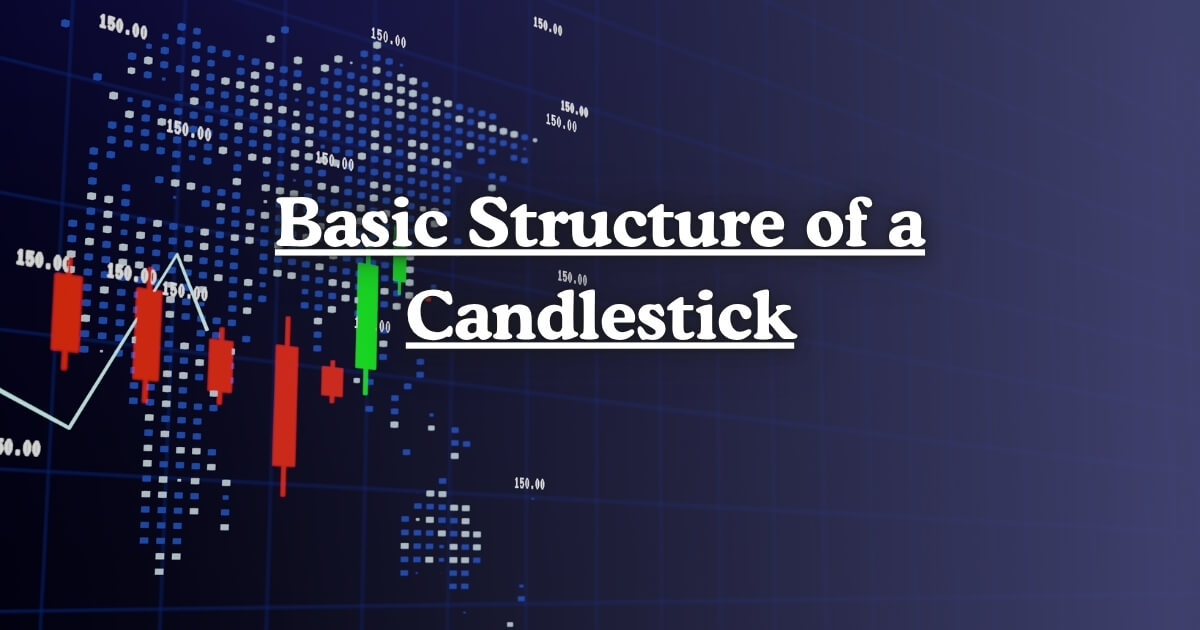
What is the Structure of a Candlestick?
The structure of a candlestick represents how price changes during a specific period of time. Each candlestick summarizes four key data points: the opening price, the closing price, the highest price and the lowest price.
These four values are visually represented using a body and two wicks (or shadows). The body shows the distance between the opening and closing prices, while the wicks represent how high and low the price moved during that period. In essence, the structure of a candlestick provides traders with a quick and clear picture of what happened in the market, helping them make smarter trading decisions.
 (1).jpg
)
- Open: where the price began.
- High: the highest price reached.
- Low: the lowest price dropped to.
- Close: where it finished.
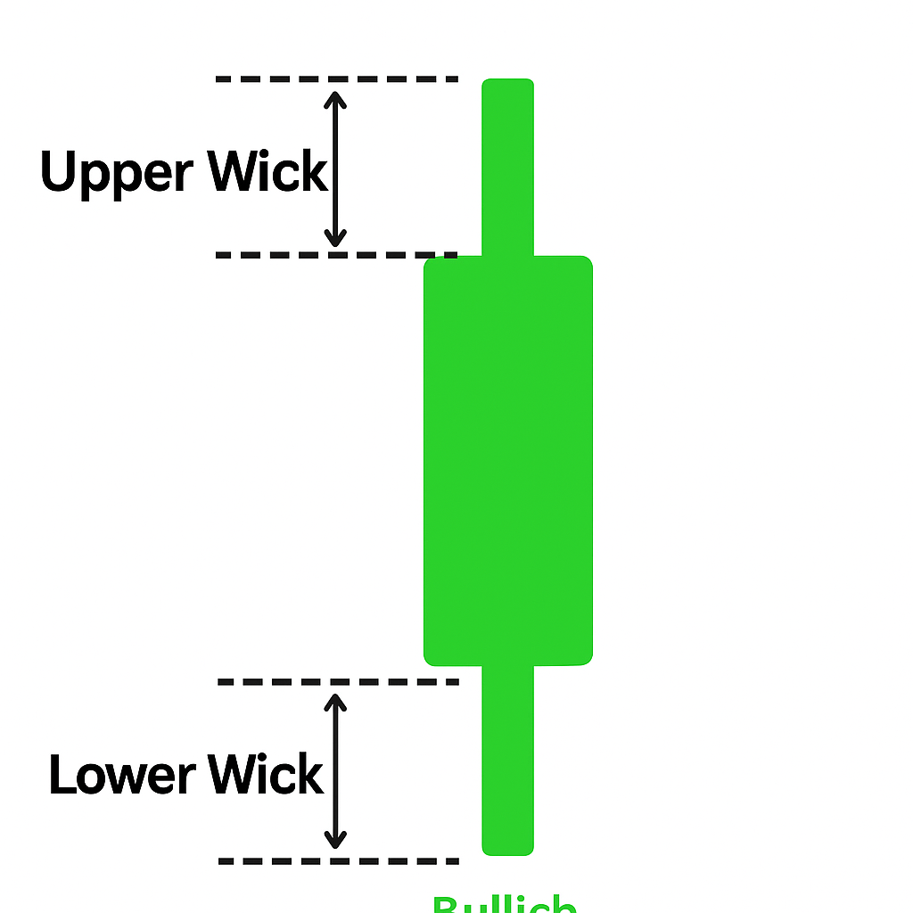
The Body of a Candlestick
The body is the main rectangular section of the candlestick. It shows the difference between the open and close prices within a specific time frame. The size and color of the body provide crucial information about market behavior.
- Long Body: Indicates strong buying or selling pressure.
- Short Body: Suggests indecision or a balanced market.
A green (or white) body means the price closed higher than it opened, signaling bullish momentum. A red (or black) body means the price closed lower than it opened, indicating bearish sentiment. The body is the most important part of the structure because it reflects the strength and direction of the price move.
The Wick or Shadow
The wick, also called the shadow, extends from the top and bottom of the body. There are two wicks:
- Upper wick: shows the highest price reached during the session.
- Lower wick: shows the lowest price reached.
The length of the wicks reveals market volatility and trader reactions.
- Long upper wick: Sellers pushed prices down after buyers tried to move it up.
- Long lower wick: Buyers stepped in to push prices higher after sellers tried to move it down.
- No wick: Indicates that the open or close was the exact high or low — a sign of strong market conviction.
Understanding the wick helps traders identify turning points and reversal signals in price trends. It reveals market sentiment beyond just numbers.
Open, Close, High, and Low Explained
Each candlestick contains four critical price points. Let’s break down how each one contributes to the structure of a candlestick.
1. Open Price
The open is the price at which trading began for that time period. In a bullish candle the open is at the bottom of the body. In a bearish candle the open is at the top of the body. This is the starting point of the market’s movement for that session.
2. Close Price
The close is the final price when the time period ends. In a bullish candle it’s at the top of the body; in a bearish candle it’s at the bottom. The close price often holds more importance than the open because it shows where the market settled — who won the battle, buyers or sellers.
3. High Price
The high is the top point of the upper wick. It represents the highest price reached during that session before sellers pushed it down.
4. Low Price
The low is the bottom point of the lower wick. It represents the lowest price reached before buyers drove it back up.
Together, these four elements — open, close, high, and low — form the complete structure of a candlestick, giving traders detailed insight into market dynamics.
Bullish (Green) vs Bearish (Red) Candles
The color of a candle is key to understanding market sentiment. The structure of a candlestick changes slightly depending on whether it’s bullish or bearish.
Bullish (Green) Candle
- The closing price is higher than the opening price.
- Indicates that buyers were in control during that session.
- The candle body is green (or white) on most charts.
- Suggests upward market momentum and potential continuation of the trend.
Bearish (Red) Candle
- The closing price is lower than the opening price.
- Indicates that sellers dominated the session.
- The candle body is red (or black) on most charts.
- Suggests downward market pressure or a possible trend reversal.
By observing a series of bullish and bearish candles, traders can easily identify whether the market is trending upward, downward, or consolidating.
How the Structure of a Candlestick Helps Traders
Understanding the structure of a candlestick gives traders several advantages:
- Quick Market Interpretation: Traders can immediately see if the market is bullish or bearish.
- Predictive Insights: Candlestick patterns like Doji, Hammer, and Engulfing are based on the candle’s structure.
- Timing Entries and Exits: Knowing where prices opened, closed, and reversed helps in planning trades more precisely.
- Identifying Sentiment: Long wicks or short bodies can show market uncertainty or strong conviction.
- Applicable Across Markets: Works in stocks, forex, commodities, and cryptocurrencies.
Simply put, the structure of a candlestick is the foundation of technical analysis — it helps traders turn raw data into meaningful insights.
Common Mistakes When Reading Candlestick Structure
Even though reading the structure of a candlestick is simple, beginners often make common errors:
- Ignoring Timeframes: A bullish candle on a 1-hour chart might be bearish on a daily chart.
- Focusing Only on Color: Always analyze wicks and body size, not just green or red.
- Forgetting Context: A single candle doesn’t define the trend — look at the overall pattern.
- Overtrading: Not every candle signals a trade opportunity. Wait for confirmation patterns.
Avoiding these mistakes ensures you interpret candlestick structures accurately and make better trading decisions.
Real-World Example of Candlestick Structure
Imagine a stock opens at $100, moves up to $110, drops to $95, and finally closes at $108.
- Open: $100
- Close: $108
- High: $110
- Low: $95
Result: A bullish candlestick (green body) with upper and lower wicks. This simple example shows how the structure of a candlestick captures the full story of price movement in just one shape.
Final Thoughts on the Structure of a Candlestick
The structure of a candlestick is much more than a technical detail — it’s the language of the market. Every body, wick, and shadow tells a part of the story about how traders reacted to price changes.
By understanding this structure, you gain the power to interpret market psychology visually, spot trends early, and make informed trading decisions. Whether you trade forex, stocks, or crypto, mastering the structure of a candlestick is a critical step toward becoming a confident and successful trader.
Leave a Reply